19 Website Optimization Experiments to Boost Conversion and Engagement
Need to boost engagement and conversions on your website, but on a dry spell of ideas? It can be hard to generate ideas, however, sometimes all you need is a bit of inspiration from proven website experiments.
To help, here are nineteen website optimization experiments you can use for inspiration and to start a conversation with your team. These nineteen are focused around boosting engagement with your website content and improve conversion rates.
Before we dive into the various experiments that you could consider, let's first cover some of the concepts that are important to keep in mind. These will help ensure you're focused with your optimization efforts and are setup to measure impact.
For those of you who don't have a proven process for website optimization and experimentation, make sure to check out the free Growth-Driven Design Certification for a wonderful blueprint.
KPIs and Metrics
If you are following the Growth-Driven Design (GDD) process then goals and KPIs should have been defined during the strategy phase of your project. First and foremost, what are your current website KPIs? How is your website performing? How are your key pages performing?
If you don’t already know, you can work out your conversion rate very quickly: if I have 500 sessions to my contact form per month and this generates 50 leads per month, I have a conversion rate of 10% (for that form).
Likewise, if I have 1000 people per month view a web page, from which 100 click through to my contact page, then I have a 10% click-through rate (from that page to my form).
Without knowing your current performance you’ll never be able to measure and track improvements over time.
A/B and Multivariate testing
Experiment testing is normally carried out via A/B testing and / or multivariate (MVT) methodology. You should have a high enough number of visitors in order to achieve statistical significance — ideally a lot more than 10000 visitors per month.
If your biggest issue is simply that you don’t have enough traffic coming to your site then perhaps focus on driving more traffic and look at experiments as a secondary priority. That said, even limited amounts of traffic and limited amounts of data can give you confidence (in lieu of statistical certainty) that you’re making improvements and that your site is heading in the right direction.
A/B testing is a controlled test between two versions of an element on your web page. For example, if option A is your current blue button, then option B would be the new red button. Your experiment should direct visitors to one version or the other and you measure which version performs better. Typically, 50% of users see version A and 50% see version B, however, if it’s an experiment you’re really not sure about you might want a smaller % viewing version B.
Multivariate Testing (MVT) is used for testing multiple elements on one page at a time. You’d typically utilize this approach when you have significant changes that you want to test. If your site has limited traffic then MVT is also probably the better option as it will more quickly enable visitor numbers to see the variety of options you want to test.
You can ask your web developers to build and code these experiments. Alternatively, tools like Google Optimize provide marketers with a way to carry out experiments without needing to rely on a developer.
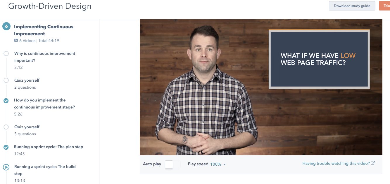
You can learn more about website experimentation, how to measure your experiments, and how to optimize a low traffic website or page in the "Implementing Continuous Improvement" class in the (free) GDD Certification.
Screenshot from the (free) Growth-Driven Design Certification.
How experiments fit with the GDD process
A website is never finished. Website experiments should form part of your monthly GDD continuous improvement cycle — step 3 on the diagram below:
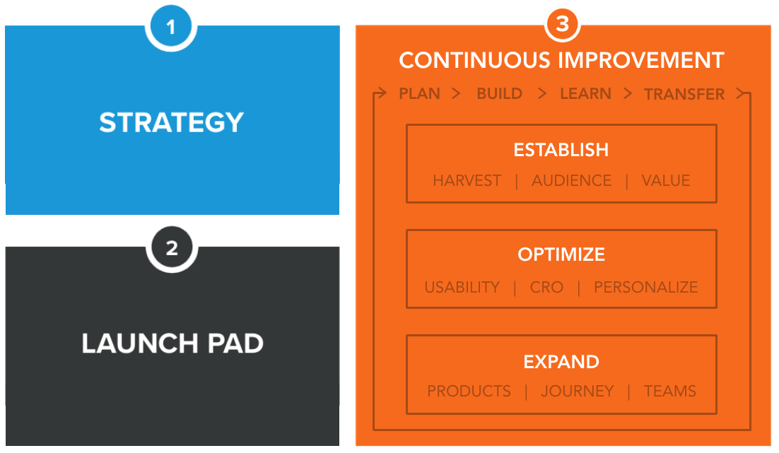
Every action undertaken during the monthly continuous improvement cycle should be an experiment. Every experiment should have a hypothesis before it begins.
What are your personas (your ideal customers) looking for, how do you think you can improve their buyer’s journey? Validate these assumptions with any available data (potentially also via user testing). Create a hypothesis, implement your improvement idea, test the idea, learn what effect it had and transfer these learnings into future experiments.
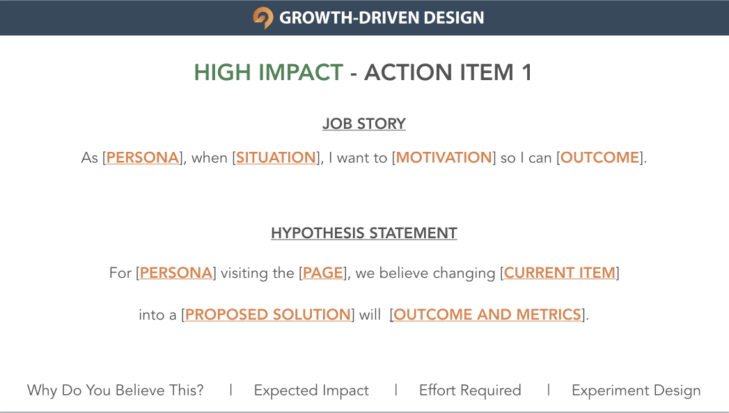
Get a free hypothesis and action item template in the (free) GDD Certification.
The onus is on trying to prove your experiment did not work (rather than proving it did). This helps avoid cognitive bias; it can be human nature to jump to false conclusions when we want them to be true. If you are unable to prove the experiment failed, it must have been a success.
This also means, as long as you learn, that it’s ok to fail.
“Many of life's failures are people who did not realize how close they were to success when they gave up.” - Thomas Edison
19 experiment ideas
Now that we've reviewed the high level considerations, let's dive into 19 different experimentation ideas.
Keep in mind, every website and audience is different. What works for one site may not work for another. This list simply provides some food for thought, and a starting point for the team to have ideation and conversation around.
10 ideas for increasing content engagement
Content must be as relevant and engaging as possible. Make the right connection by delivering a strong user experience and increase the likelihood of users wanting to contact and purchase from you.
1. Optimize the SEO snippet
First impression relevancy is essential. Many online user experiences start with Google search — they don’t start on your website. An example SEO snippet:
 Carry out an experiment with your snippet. Try changing the text to optimally set visitor expectations and to create relevance and engagement from the very start of their interaction. Make sure the snippet and your landing page dovetail in every way.
2. Change your page content
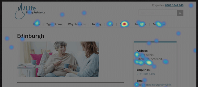
Once users have landed on your page, are you providing them with enough value to remain and to stay engaged? Using tools like HotJar, look at visitor recordings, cursor movement and clicks — are people engaging with your content or are they switching off? Are they focusing more on some content areas than others?
If you believe that your current content is not adding value then try changing it - always aim to give users what they are looking for. Perhaps simplify your message, change your tone, change your headline or, if none of these are making a difference, you need to re-write your proposition.
3. Change your font
A 2002 study by the Software Usability and Research Laboratory concluded that the most readable on screen fonts are Sans-serif fonts (these are fonts that don’t have any extending features, for example fonts like Arial, Verdana and Tahoma).
In terms of font size, bigger is usually better. Click Laboratory increased their font size from 10pt Arial to 13pt and also added a little more spacing (leading) between each line. This reduced their bounce rate and led to a 133% improvement in their form conversion rate.
Think about your audience. Whilst Comic Sans won’t be right for hipsters, it could be spot on if your website is for younger children.
4. Make your page look more appealing
Humans make snap decisions and tend to post-rationalise. Apply this theory to website design. In under 1/10th of a second, based on the way it looks, your visitor is going to form an instant judgment about your website.
One easy route to adopt and experiment with is to follow design conventions. Look at popular sites like Amazon, Ebay, Facebook and the BBC. Potentially look at your competitors too — particularly the most well known. Are there design elements that you could try, things that help make the visitor feel more at ease and more comfortable on your site?
For example, have you used high quality imagery at a good size? What is your first impression of this older BBC News website design compared to their current design?
Visitors are more likely to engage with websites that appear fresh and modern.5. Change copy width
Long sentences that run across a full screen width are harder to read than short concise blocks of copy. Users scan text looking for what is most relevant to them.
Also, don’t worry about having too much white space either side of your column of text — white space helps the content to breath and increases legibility.
The following is a screenshot of the BBC News site when viewed on a large monitor. The text stays in a comparatively narrow block in order to maintain readability and, therefore, support user engagement.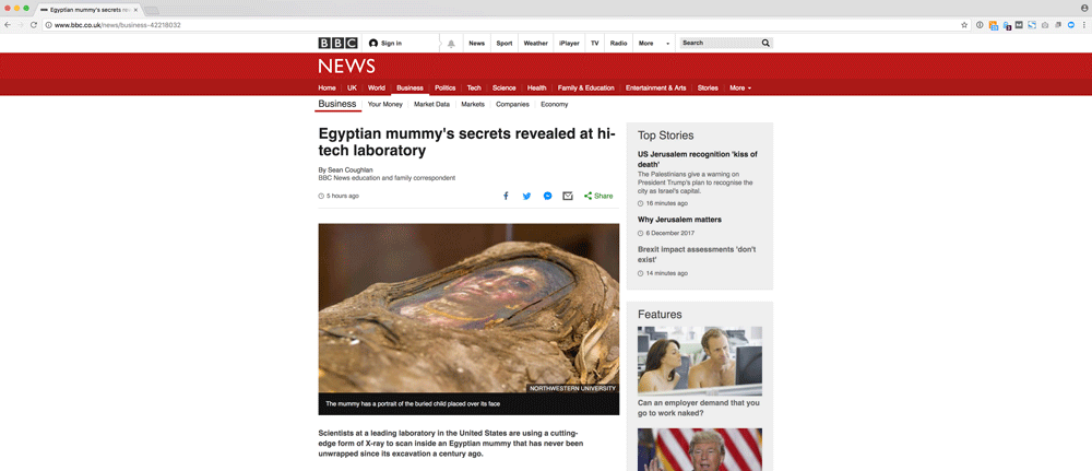
6. Improve page load performance
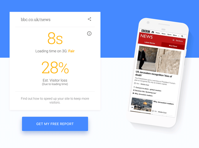
Having your page load quickly helps from an SEO perspective, but it also really helps from a UX perspective — especially for mobile users.
Google have a free tool that will test your mobile speed: https://testmysite.withgoogle.com. Once users are on your site, having all pages load quickly will support their ongoing engagement. A study by KISSmetrics found that a 1 second delay in page load results in a 7% drop in conversions.
Note: unlike many of these experiment ideas, image file resizing aside, you will almost certainly need a developer to help you implement page load speed experiments as they invariably require code changes.
7. Change the colors
Color conveys meaning and emotion. Do the colors you are using match with your proposition? Are there any alternate colors that might better support the action and the emotion you want to create? Watch out for website accessibility too — is the color contrast strong enough, can colorblind people use your site? 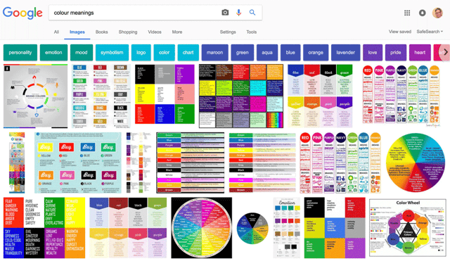
8. Change your CTA text
CTAs should be relevant and timely, and they should change depending on where the user is within the buyer’s journey.
Most CTAs are short headlines and buttons. They are text based and therefore comparatively easy to A/B test.
In terms of general CTA guidelines, keep text concise, use plain language and keep everything action-oriented. You are looking to provoke an emotion and / or a desire. Make sure users can clearly see ‘what’s in it for them’. CTAs are also a place where a little creativity can go a long way. Check out this list of 31 Call To Action examples.
9. Add social proofing
Do you currently have any social proofing on your website? Social proofing can help provide visitors with the reassurance that, if they engage with you, you will successfully deliver for them as you have already done so for other customers.
Social proofing provides a human touch. It is not you ‘telling’ people how good you are, it is your existing customers ‘showing’ how good you are.
Social proofing can come in several forms:
i) 1 to 5 ratings (like TripAdvisor and Google Reviews)
ii) 'Customers who bought this also purchased' (like Amazon)
iii) Stats about availability and deliverability, for example, 99.6% of our orders arrived on time, or, 86% of our customers would recommend us to a friend.
10. Simplify your site navigation
Is it easy for people to move around your website, or is your navigation overwhelming? Google Analytics might tell you what is happening, but not necessarily why. How are visitors moving from one page to the next? Watch some HotJar screen recordings (or do some user testing). Is your main navigation being used as intended?
Can you offer more with less? Is your navigation consistent across the site? Is your navigation consistent with other websites, or are your forcing users to learn something new in order to use your website?
9 ideas for improving conversions
The above were ideas and experiments for increasing visitor engagement. The following are more geared toward improving conversions, although they are not mutually exclusive.
1. Offer more contact mediums
Having a contact form is great, but are there other ways you can trial having customers reach-out to you? Have you tried promoting your phone number, perhaps on all pages in the header of your website so that anyone wanting to call you can do so immediately? Are your email details available? What about trying live chat, or a feature like ‘book an appointment’?
If you experiment with alternate contact methods then find a way to track and measure them, for example, ResponseTap for phone calls. You need to make sure that you can:
i) attribute these leads as being from website activity; and
ii) measure performance to know if your experiment is effective or not.
2. Simplify your form
Typically, the fewer fields you have on your form the more likely the chance of someone filling it in. Experiment to find the balance between the core data you require (to qualify a lead) and the minimum amount of form fields you can use.
Make sure that accessibility and standard interface requirements are met too. Can users tab through fields on a keyboard? Are you providing a consistent form experience?
3. Remove all other distractions
The following WWF conversion page has no distractions from its core message. There are hardly any links to other pages (and they are a lot smaller / less significant than the donate form). The CTA is emotionally compelling - the reason for donating is visually and verbally reinforced. A donation amount is also pre-selected and users need to do very little to start this conversion process.
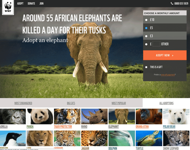
Look at your own conversion forms and landing pages. Are they as single-minded in their attempt to convert? Is there any clutter you can remove?
4. Above the fold
The WWF example also keeps all of the key information above the fold (users don’t need to scroll to see any of the conversion information). Review your forms and look at your average fold length — can you move more of your key conversion content above the fold?
5. Introduce a sense of urgency
Consider introducing time-gated offers. This doesn’t have to be a merchandise offer, it could also be a time-limited content offer. In the example below, the days, hours, minutes and seconds (just next to the price) all countdown in real-time. Can you find a way to encourage users to take action in a timely manner?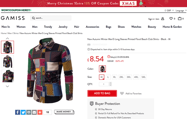
6. An alternative to ‘Submit’
Does your form finish with ‘Submit’? Is there anything more helpful or more action-orientated that you could change it to? How about experimenting with ‘Start Conversation’, or something else that is warmer, more human and indicative of what will happen next?
7. Ask your users
A neat little experiment to run is an exit survey (we normally use HotJar for these). You can trigger an exit survey to appear on specific pages — i.e your contact form — when it looks like a user is about to abandon the web page. Simply by asking a question along the lines of ‘why are you leaving?’ you will (hopefully) get some insight and ideas for things that you can change and improve.
8. Identify fields that are causing drop-offs
HotJar (other tools are available!) allows you to analyze and identify specific form field performance. Once you’ve identified bottlenecks and specific drop-off points try either removing these fields entirely, or renaming them (if it is data you definitely need to capture).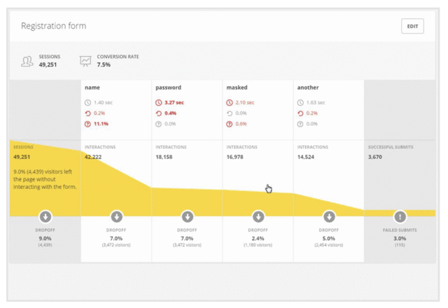
9. Human empathy
Anything that helps a person feel more connected to your products, service and brand makes them more inclined to buy from and more inclined to trust you.
Is your form page looking too functional and clinical? Can you show more empathy? Perhaps highlight the team or key people that prospects will be contacting. Can you deliver a sense of what it will be like to deal with you and how you will be able to help and support?
A job well done
Remember, it is essential that you link your experiments back to your goals and KPIs. If you do this then you’ll be able to give yourself a pat on the back when you can demonstrably prove an experiment has made a positive impact on your website's performance. You’ll have improved performance for your organization, your client and for the end-user. Personally, I find that a very satisfying feeling!
Happy experimenting!
Main article photo by Casey Horner on Unsplash

Luke is Head of Growth-Driven Design at Klood Digital. He loves helping clients get the most from their websites and is always happy to discuss ideas for improvement over a good cup of coffee. https://www.linkedin.com/in/luke-brason/


