Let's say your website is gaining a lot of attention — traffic is flooding your way via an effective SEO, paid search, social or inbound marketing strategy, and you feel justifiably excited about that.
But then you notice these visitors aren't taking the steps you initially intended them to; you're reaping in the visits, but only a handful have clicked your call-to-action or filled out your form.
So you want to convert more of these visitors into customers. Or maybe you just want them to download your e-book. Whatever action you want your visitors to take, Conversion Rate Optimization (CRO) is your best chance.
Initially, CRO might seem like a daunting task, but try thinking of it like you're perfecting a recipe for a delicious cake. It's all about making data-driven decisions around the ingredients which make your website great. If you need some guidance with that, here are 10 best practices for upping the percentage of your conversions:
1. Check your traffic
Where are people dropping off from your desired user flow? And where are they coming from?
To work out what pages need to be optimized on your website, you must look at your website traffic. First, look at your data to identify what's under-performing compared to industry metrics or other pages on your website.
A great way to do this is to use a COS like HubSpot, which shows you the analytics for each page. This is how you'll see where people are disengaging from your website.
Second is something that's often overlooked — the influence of traffic sources. If you're just measuring how your page converts every single visitor without considering where those visitors are coming from, you might miss-identify issues. A great example of this comes from Hendrik Haandrikman of Divitel:
"We provide video delivery tech integration services. By some fluke, we get a lot of traffic from people looking for a particular Chrome plugin for video playback. These are consumers and not part of our target audience of broadcasters, operators and content creators. If I don't filter out those consumers when judging the conversion of a certain page, it'll skew the numbers, which might cause me to make decisions based on false assumptions."
2. Optimize your page load times

Slow and steady won't win the race this time, my friends. Speed is key for a converting website. In fact, Aberdeen found that just a one-second delay in page-load time can have drastic effects.
According to their study, it can equal 11 percent fewer page views, a 16 percent decrease in customer satisfaction, and a seven percent loss in conversions.
The dreaded "spinning wheel of death" is more likely to infuriate your visitors than ever before. So make sure your page loads quickly, or people will abandon it before you even get the chance to convert them.
3. Write to convert
Both design and messaging have a big impact on conversion. So here are some of my favorite tips for writing converting copy:
- Talk to your buyer personas — these are the people you're trying to target, so research them well in order to communicate your message in the most effective way.
- As Luke Wroblewski once said, 'obvious always wins'. No one is going to complain that your website is too simple to understand. Be clear, concise and accessible with your messaging to help your words radiate trustworthiness.
- Directly address your readers by using second person language such as 'you' and 'your'.
- Add some positive reviews from satisfied customers for legitimacy.
- Use active-voice and verbs to give your writing that extra bit of energy. For example, 'The free guide can be downloaded here' would be much more direct, actionable and snappy as 'Download your free guide now!'
- Try to make it clear who’s doing what. For example, 'We’ve put together a whitepaper to tell you more' sounds much more warm, descriptive and inviting than 'See this whitepaper for more information'.
- Bullet points, numbered lists and short, concise sentences are your friends! They keep the attention of your readers and avoid unclear 'waffle', which reduces credibility and confidence.
4. Forms
Forms must always be above the fold, and effortless to fill in. If you have the option to have your system automatically fill in any known fields — go for it. The less typing they have to do, the more chance your visitors will submit their information.
What's more, best practice was once to put these forms to the right-hand side of your landing pages. However, this doesn't seem to be the case any more. Recent tests have proven that contact forms don't always perform better on the right-hand side of the page.
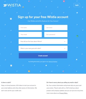
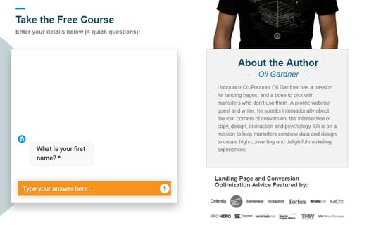
Take Wistia, for example — their landing pages have forms placed in the center of the page. Or Unbounce, who use chat boxes in the left hand side of the page as a form.
There really is no rule — you just need to test which placement works best for your website. It's all part of the growth-driven design process.
5. Calls to action
These buttons or image CTAs encourage your readers to take a certain action. Using bright colors, clear text and active language will help entice readers to click through.
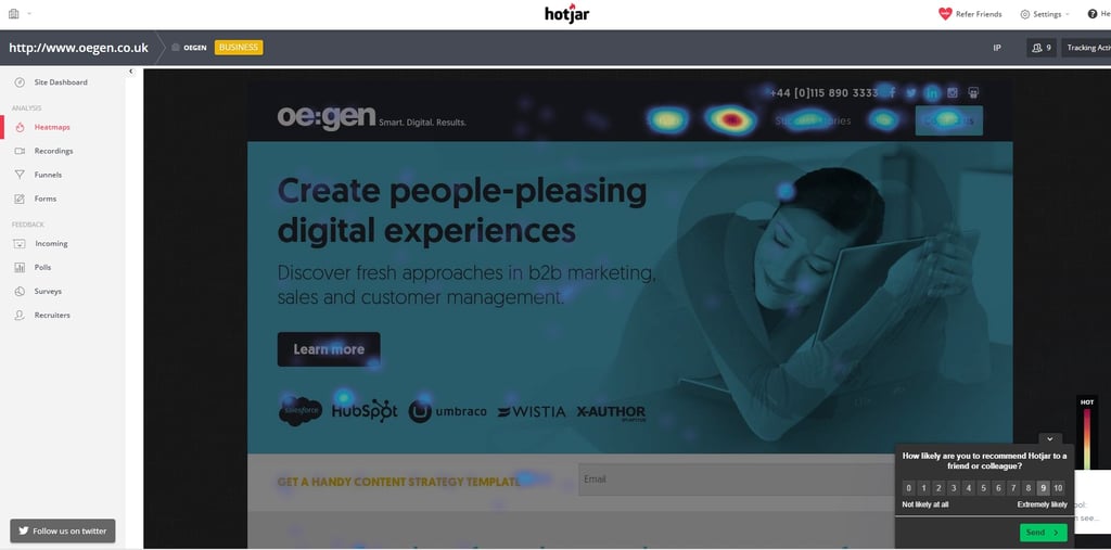
You can view the performance of your CTAs using a COS like HubSpot. Or, if you like, you can use HotJar, which will show you heat maps of where your visitors' eyes are being drawn to most.
Be careful though, because too many CTAs on one page will confuse the reader about which action to take. As Corporate Web Service's John McMahon says:
"Focus on what you want people to do and make it easy to convert. Streamline a page as much as you can to really get to the core of what you're after. Don't present people with 15 related links (or even 5) that take them away from what you want them to do, and get them lost somewhere else on your site."
It's best to resist the urge to give your visitors too much choice and keep it to one or two CTAs on a page.
6. Typography
Font choice, colors, size, and placement all play a bigger part in getting your message across than you might realize. So before you completely change your painstakingly-thought-out value proposition, it might be better to test different formatting to see which works best.
7. Browser testing
Make sure your website works well on all browsers. Use your Google analytics or HubSpot performance breakdown to find issues and look for any significant drops in conversion rate or engagement metrics. Useful things to look for would be how long people spend on a page and if there are any high bounce rates.
Then, perform user testing on different browsers to view where the issues lie. You could use HotJar for this too — look at heatmaps, watch user recordings, and set up one-question surveys on your website for user feedback.
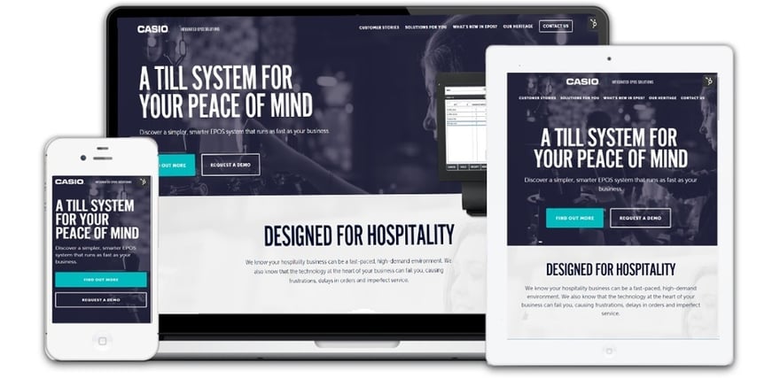
8. Mobile friendly
Is your website mobile-optimized? According to official Google statements, more than 50 percent of search queries globally now come from mobile devices. If your website doesn't translate across mobile devices, you're missing out on a lot of visitors. You need to make sure that your website is adaptable to different screen sizes, and as easy (if not easier) to navigate as it would be on a desktop or laptop.
9. Remove the clutter
White space (i.e. the negative space between the elements on your page) allows you to really focus on the important stuff on your page. It separates the elements in your design and makes your page much easier on the eye, transforming it from an unbalanced, untidy space to a more accessible, legible, CTA-highlighting conversion machine.
10. A/B testing
Compare versions of certain elements of your pages to see which performs better. Testing this way can help you make informed decisions about the design and messaging on your website. It's also a big part of the growth-driven-design methodology.
Perform tests on specific aspects of each page in steps, starting with different CTA designs or form placement. As Tim Mehta of Designzillas says:
"Only test things that are micro goals which lead to your main KPIs. It's easy to get excited and test everything you can, but it's not an efficient use of your time."
All you need to do to perform an A/B test is:
- Analyze your current performance data for a certain element of a page
- Hypothesize the new design, placement or text, and create the new version
- A/B test
- Compare the results.
With CRO, we're not trying to manipulate visitors into converting, we're just trying to make our websites better places to browse. Following these best practices will help you ease the journey of those interested in your offer, so they can quickly and confidently reach a converting decision.
The goal is simply to achieve a better user experience for your visitors by editing any possible barriers. Try it out for yourself!