Landing pages are where the holy grail of digital marketing takes place - that exchange of content for data. But keeping your landing pages fresh and engaging can be tricky. In this article, I’m going to show you seven kick-ass landing pages that will provide some inspiration to get your content machine whirring.
For those of you not 100% familiar with what a landing page is, here is a refresher taken straight from Hubspot’s Academy.
"Landing pages are your digital sales reps….they do the heavy lifting of convincing your visitors to fill out a form and become leads."
The landing page mix – what all landing pages have in common
All landing pages share a similar mix of components, all designed to channel a user into the exchange of their contact details for content. The mix can vary, but in most cases landing pages will have the following elements in common:
- No menus
Most landing pages don’t have a menu. This is because marketers don’t want users wandering off without filling in the form. - A Form
The form is captures the contact data and is the most important element on the page from a marketer's perspective. - minimal text
Most landing pages keep messaging clear and succinct. - The offer is the hero
Typically the content offer and supporting graphics are the hero items, designed to capture attention and visually sell themselves. - Branding
Prominent branding is key, as landing pages often standalone from the main website and are marketed independently. - clear action orientated headlines
Users like to know what happens next. Clear instructions on what the page delivers after the form is completed is always a good idea e.g. a downloadable PDF or an embedded video. - Social sharing
If the content offer is good enough to share, you’ll want users to share it with their social networks by clicking the social sharing links on the page.
The challenge is to blend these elements together and create a page that converts well. Typically the goal of a good landing page is a conversion rate of 20% or higher, which is no easy task.
Let’s dive into some kick–ass examples to see how it’s done.
Kick-Ass Landing Pages
#1 Netflix – “Watch anywhere. Cancel anytime.”
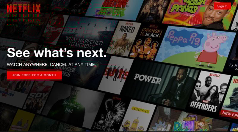
I love the simplicity of this design and the messaging. It’s very minimal, yet the brand and message balance perfectly. And no matter where you look, your eye is drawn to the call-to-action. Even if someone had never heard of Netflix (maybe this person's out there?), they would still know what this page is about.
What I find interesting is that they have used red as the primary button color, flying against alI UX rules. Red is instinctively ingrained in us all to mean: danger, caution or stop. But, it clearly works for Netflix and is a clever way to make themselves stand out.
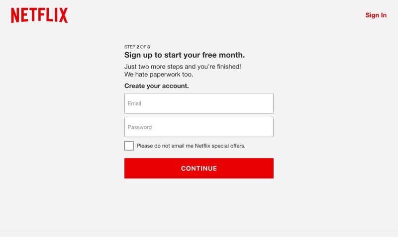
Netflix have been very selective in their landing page mix, but the key items have been considered. There is no menu, branding is clear, messaging is succinct and powerful, imagery is bold, and clear instructions lead to a call to action. What I think is particularly clever is that they have taken the long form out of the landing page and turned it into a journey over a couple of form fills.
Recent UX studies have shown that the shorter the form the higher the chance of conversion. Netflix applies this concept by collecting the data they need in what feels like a very simple, step-by-step sign up process.
#2 Drive with Uber
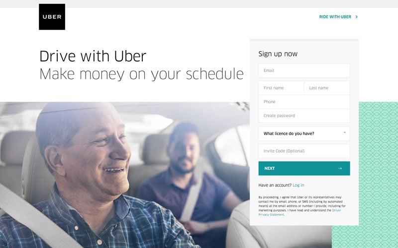
This is a great example of how simplicity and white space can have a huge visual impact. All the ingredients of the mix are on this page, but the presentation is where the effectiveness lies.
Beautiful open typography conveys the message and the brand. Aspirational imagery further reinforces the messaging. Type and image dominate the page, occupying 75% of the space, which takes the emphasis off what is quite a long form.
All of the elements on this landing page also share the same complimentary color palette, which is neutral and relaxing. The CTA under form is the only area of solid color, which is sufficient for it to stand out without it being overpowering. For me, this page is a real master class in how to create a great looking landing page.
#3 Klientboost
http://grow.klientboost.com/get-phone-leads
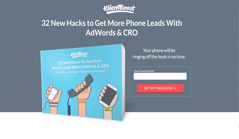
The strength in this landing page is in the treatment of the content offer. The content offer guide is positioned slightly over the gray background, which makes it jump off the page and takes all the emphasis off the form. The offer looks like a real book that users could literally reach into the screen and pull out. Supporting text that describes the offer is cleverly built into the book cover. The form is short and neatly tied into background.
This appealing design and treatment of the content offer far outweighs the effort required to complete the form. I suspect this page converts very well.
#4 Apple – Mac OS Sierra
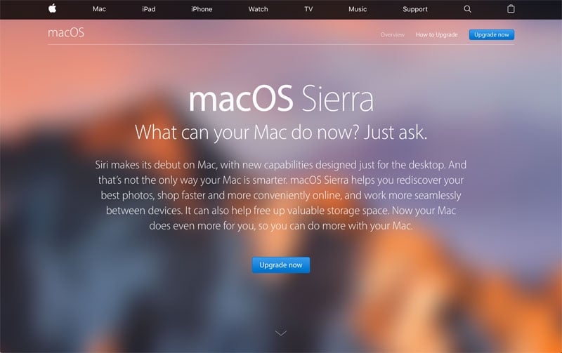
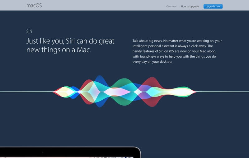
What's particularly clever about this landing page is the way that it interacts with the user. Initially, the user is presented with a full menu, message and call to action. As the user scrolls down the page, the menu is hidden and the content is gradually revealed.
This landing page takes users on a journey through the content while maintaining an easily-accessible CTA all the way through to get to a form. While this page breaks the rule about having a minimal amount of text, it presents a lot of information in a succinct way.
#5 G-Suite
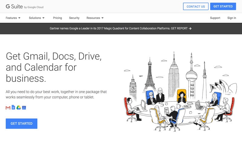
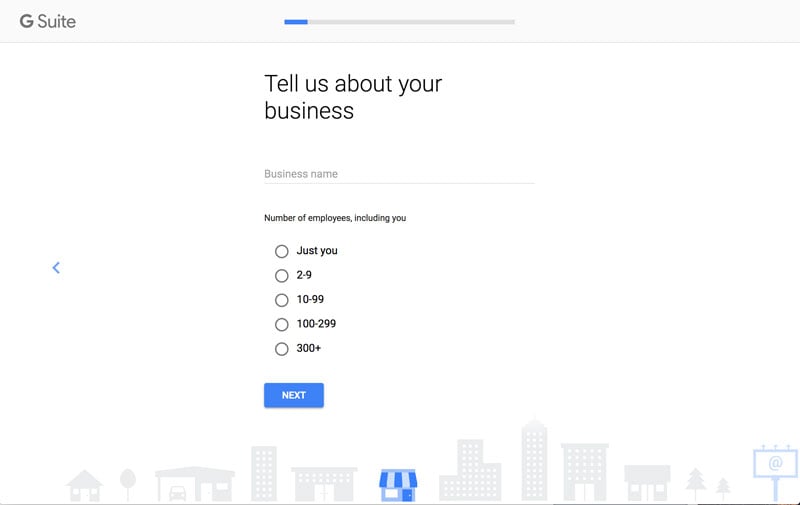
There appears to be an increasing trend in landing pages to put forms into a light box or to move them onto another page. This is another example of the latter where there is a multi-page sign up process.
Google has created an open, white design that uses their key colors to reinforce the brand. The predominance of white puts all the emphasis on the two CTAs, which lead into a simple, step-by-step sign up process. Like the Netflix example, the process breaks up data collection into small manageable steps for the visitor on the page. The page does feature a menu system, but in the overall hierarchy of page elements, it is subtle and played down in favor of the CTAs. Messaging is simple with the headline doing all the work.
#6 The British Red Cross – Grenfell Tower Appeal
https://beta.redcross.org.uk/appeal/London-fire-relief-fund
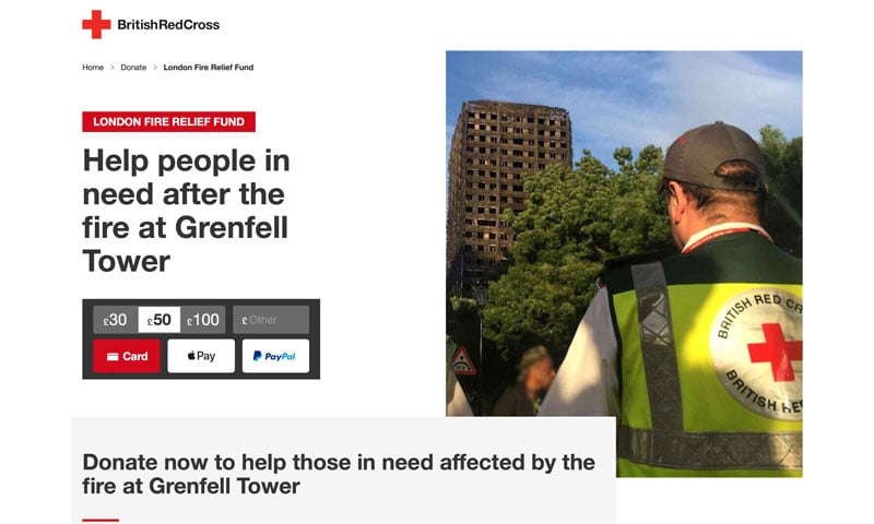
For an organization that has been around since 1870, the Red Cross really knows how to stay up to date. This landing page uses negative space well to put all the emphasis on the CTA and donation mechanism. The image on the right and the gray text panel below, frame the donation area. The choice of image is also superb, almost iconic in its positioning of the Red Cross alongside the burnt out remains of Grenfell Tower. The headline and subhead are clear and succinct. While the menu has been removed, a crumb trail offers users a way back into the site, which is a nice touch to avoid appearing too focused on getting a donation.
On the other hand, the time-saving one-click option to jump to the donation mechanism is a great example of how simplifying a design can positively impact user experience and conversion.
#7 Inside D&AD
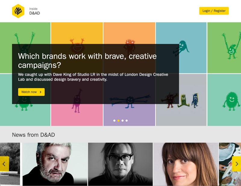
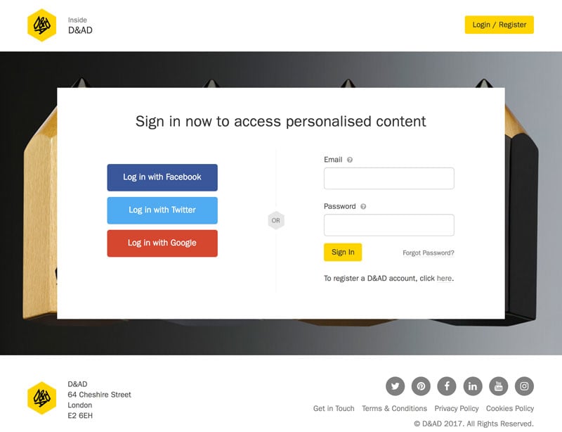
The D&AD should know a thing or two about design and this landing page doesn’t disappoint. The clever use of a slider brings four separate content offers to a single landing page. Each CTA brings you to a new page, which offers two sign up options. The functionality is simple yet effective. The use of the D&AD yellow to bring attention to the CTAs brings the branding together. This is continued throughout the design with black and yellow buttons and supporting color and monochromatic imagery.
Messaging is succinct and clear and there is no hint of a requirement to complete a form to access the content. When a form does appear on the page, it is neat and the login/registration options are short and simple.
Final thoughts
Hopefully these examples have inspired you as you pen your next landing page design. And if you need any more help, consider these three tips:
Keep an eye on what others are doing
Thousands of companies are publishing landing pages every day, so there's a lot of content to draw inspiration from. See what other companies are doing and learn from their work. Some ideas will work for your industry, others won’t, but all of them can take your thinking in new directions.
Test and test again
A/B testing is the key to finding out if your landing page is a hit or not. Make small incremental changes and find out what works and what doesn’t. If you're designing for more than one brand you’ll need to test per audience as what works for one, doesn’t necessarily work for another.
Know your audience
Be guided by your audience and what you know about them. Ask yourself whether the design decisions you have made are appropriate to this audience. "Is the form too long? Is it asking the right questions? Does the page have the right imagery or colors?" Question everything and validate your decisions against what you know about your audience.