Many of us have heard the common phrase: “Your website is your 24/7 salesperson.”
Well, there’s good reason for it—it’s because it’s true. Good, bad or just plain mediocre, your website is your digital storefront that customers and prospects depend on when researching your brand online. And if you’re doing it right, your website can be the best and most accessible sales tool you can provide these visitors.
But is your current website really working that hard for you right now, or is it dropping back to more of a part-time situation? In addition to design and UX (two essential factors in a website built with HubSpot’s growth-driven design methodology in mind), another essential contributor is its language.
Because your site is such an important business tool, it’s crucial that you communicate the exact right message you want your target audience to see so your site can start working its hardest for you.
So, great! Just write up some copy, pop it into your website and that’s it, right? Well, unfortunately, not exactly. If you’re new to copywriting, there are a few important best practices you’ll need to keep in mind that can not only help you keep copy on track, but also equip your website with the information it needs to be that 24/7 salesperson you know it can be.
Take a look at these nine website copywriting best practices that every beginner-level copywriter should keep handy when getting started writing web copy:
1. Identify your audience.
.gif?width=1024&name=giphy%20(1).gif "giphy (1).gif")
First and foremost, you gotta know who you’re talking to. In line with the first phase of the growth-driven design methodology—the strategy—one of the first things you need to do is create your buyer personas. Why? Because as a business, your goal is to create a website that is centered around your users, designed with an empathetic understanding of their lifestyles, needs and preferences.
Creating personas allows you to personalize your website content (and complementary inbound marketing materials) to speak to exactly the right people in just the manner they want to see it.
2. Create clear headlines that are concise and enticing.
If you’re banking on your website visitors reading every page of your site (or even all of the copy on one page), then you may be disappointed in the reality. That means your first impression has to be great, especially on your home page.
In a Washington Post article by Chris Cillizza, it highlights some of the stats on how much content is actually consumed (and not consumed) by readers—and it’s pretty surprising. Cillizza claims that in a study conducted by the Media Insight Project, only 41 percent of Americans report that they watched, read or heard any in-depth news stories, beyond the headlines, in the last week.
So what does that mean for us writers? Plan for scanning. Honestly, you’re probably doing it right now. Because with the saturation of content on the internet today, if you’re not scanning for the key takeaways, you’re in the minority.
Here’s how Canva lays out their site with clear headlines and scannable content:
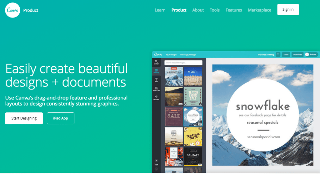
From the start, you see exactly what Canva is all about and how they empower users to design: “Easily create beautiful designs + documents”. This gives users a general idea of what they can expect from this site.
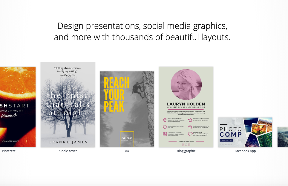
Then you see the next section below the fold, which has another clear, yet descriptive H2: “Design presentations, social media graphics, and more with thousands of beautiful layouts.” This concise language speaks to the some of the specific needs a user might have.
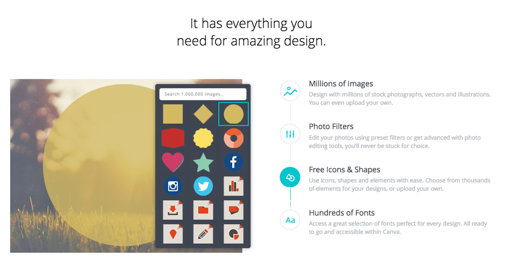
It even breaks the next section down into bite-sized bits of information: “Millions of Images”, “Photo Filters”, “Free Icons & Shapes” and “Hundreds of Fonts”—all with brief descriptions that are easy to scan and absorb in a rush.
So, use your headlines as the prime real estate that they are and capture the attention of your visitors with clear headlines that are direct and to the point. Headlines are a great place for implementing keywords and other key topics that will benefit your readers.
(Want even more helpful information about writing for scanners? Read this great article about how to write for today’s online readers now.)
3. Avoid using negatives where possible.
When it comes to creating a tone for your brand, you want to be remembered for the positive, solution-oriented tone you set in your copy—not the negative stuff that might discourage a customer from learning more about your business.
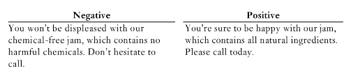
Nan Levinson gave two great examples of the difference in her book How to Sharpen Your Business Writing Skills: Second Edition.
Example #1:
Example #2:
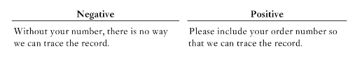
See the difference? Creating a positive tone for your users allows them to gain trust in your brand, as you provide a positive solution to their problem or desire. While there may be instances when creating a sense of fear or urgency to take action may be appropriate, a good rule of thumb is to start with the positive first.
4. Talk about them more than yourself.
To be direct with this, literally use the word “you” more in your website copy.
In Entrepreneur’s article “10 Powerfully Persuasive Words Your Customers Want to Hear”, the word “you” comes in at #7, behind other emotionally stimulating words like “free”, “easy”, “guaranteed” and more.
Quite simply, using the word “you” makes people’s ears perk up a little. As a species, humans are wired to think about what’s in our best interest when making decisions—so naturally, we gravitate toward content that speaks directly to us. It makes us feel special, included and connected because the writing is more personal, conversational and relatable.
5. Relate to their experiences and appeal to their emotions.

Similar to the point above, your website copy has to apply directly to your visitors’ emotions.
Unbounce published a totally awesome article a couple years ago that helps writers know how to use content to appeal to users who may be experiencing one of the seven deadly sins. What they outlined was a short and sweet guideline to dealing with different emotions through content:
Are they feeling “lust”? Appeal to “desire” in your copy. How about “pride”? Dish back with “confidence”. “Gluttony”? Go with “self-interest”.
6. Speak their language.
In a blog I wrote back in 2015—Humanizing Your Brand: 8 Tips for Making Your Voice Real (and Heard)—I shared some best practices for creating personalized, engaging copy that speaks your audience’s language and entices them to relate.

In the example ad, Dollar Shave Club used humor to speak directly to their target audience. Though they are strictly an e-commerce business (which can often feel more sales-y and less personal), they found a creative way to put a personality to their brand and creating a lasting impression on customers and prospects alike.
On the opposite end of the spectrum, if you are a technical business, you should have common technical language and jargon that’s used within your industry to create credibility. If you’re a personal injury firm, you should use language that’s sensitive to car accident victims or families of victims that may have just experienced a traumatic situation.
The goal is to speak to your audience in the way that they will receive your brand’s information best. Think “search”, not SEO.
7. Trim the (content) fat where possible.
Is it relevant? Is it necessary? Is it providing value to the user?
If the answer to these is “no”, then it’s time to get rid of the fluff. Some people get caught up in the misconception that a website has to have tons of content to rank well in searches, but the reality is that unless it’s valuable and clear to the user, a surplus of content is only going to prevent them from taking an action (be it making a purchase, signing up for a newsletter, scheduling a consultation, etc.). And if that’s the ultimate goal—for users to take some kind of action—why would we want to make it harder for them to do so? Which leads me to my next point: don’t make them think—make them do.
8. Use hyperlinks within the copy to make it easier for users to navigate.
In Steve Krug’s book Don’t Make Me Think, Revisited: A Common Sense Approach to Web Usability (as well as in the first and second editions of this series), Krug talks about the importance of making things as simple as humanly possible for website visitors. Although a lot of the material covered speaks to web designers, it is also helpful for content developers and marketers as well.
Internal and external linking (where appropriate) doesn’t just tickle Google’s fancy—it also lets your users have the most fluid user experience possible. It empowers them to learn more about either your business (internal links) or about a relative topic to your business (external links) without them having to do any work themselves other than a click. Your website copy should include mostly internal links to other pages on your website, but other content (such as blogs, e-books, infographics, etc.), external links can be beneficial for helping educate your users, as well as get some “link juice” in return. Both demonstrate that your users’ best interests are top of mind.
But, with great power comes great responsibility.

Hyperlinks should never be taken advantage of. In fact, Google will likely penalize you for too many or irrelevant links. So be sure to stay up to date with how to avoid over-optimizing your site with links and keywords.
9. Use verbs and multiple words in your CTAs.
Consider this: You get to a website that really sparks your interest, you like what they have to say and you’re ready to engage more with their brand online. You see a call to action that reads “Work”.
At first you may think, “Oh, they want me to view more of their work now.” But then, you think, “Or do they want me to apply for a job there?” The least amount of ambiguity you can create for your users, the better. And the best way to do that is to use verbs as the first word of your CTA.
In addition to using verbs, it’s important to be very clear in your calls-to-action (CTAs) about what it is that you want them to do. Just writing the word “Submit” won’t necessarily entice someone to take action, especially if they’re scanning the page and don’t know the context of the ask. So you’ve gotta use two or more words to be clear about what you want them to do.
Maybe they want a free piece of content from you. Tell them they can get it! “Download Our Free E-Book” is direct and enticing way to communicate that. Do they need to see more about your past work/clients before choosing to do business with you? Give them a CTA that speaks to that, like one of these: “View Our Case Studies”, “See Our Results”, “View Our Testimonials”, “Calculate Your Results”, “Start Your Free Trial”, or “Request a Consultation”.
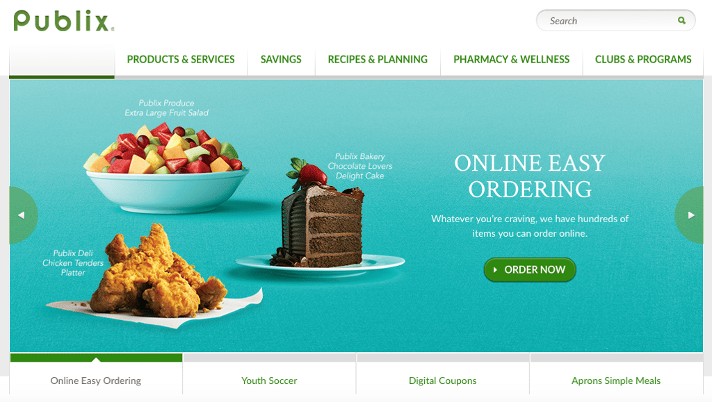
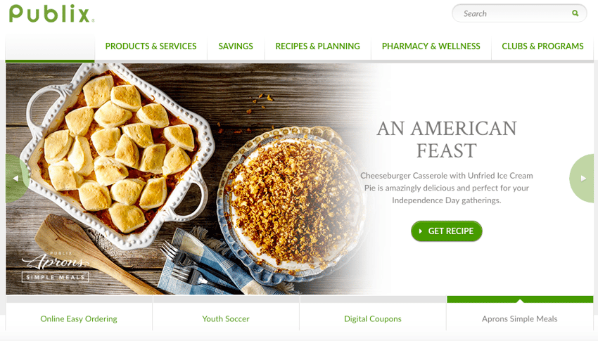
Here are a couple of ways Publix made their CTAs clear and action-oriented on their site:
Example #1: “Order Now” in the section Online Easy Ordering
Example #2: “Get Recipe” in the section Aprons Simple Meals
The point is: be clear in your CTAs of the action you want them to take, and you can easily do that with verbs that are clear and direct. Here are some other great examples of CTAs you just can’t help but click on.
Ready to learn more about copywriting and other essential best practices for your website?