7 Common Usability Errors in Web Design
Any successful web designer knows how important it is to keep up with trends and best practices in the industry. Between things like using authentic imagery and video, embracing minimalism where appropriate, and everything in between, there are a ton of design standards and guidelines to keep in mind when designing for the web.
But what’s easy to miss is the usability factor. Though we all want websites that dazzle and impress, we still want (and need) them to function well, too. But it's not uncommon to find ourselves doing this:
Here are seven common usability errors and suggestions for how they can be fixed for a better user experience:
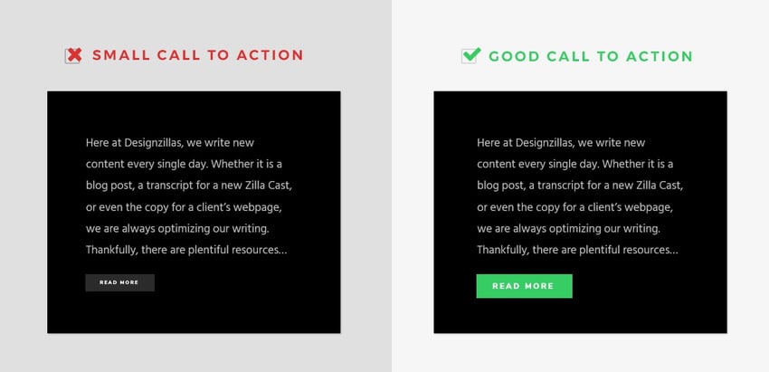
1. Tiny Clickable Regions
The solution: Make buttons bigger.
Whether someone is using a mouse on a desktop, a trackpad on a laptop or a finger on a mobile phone to click, each method of getting to your CTA has to be easy to do in order to minimize frustration, maintain engagement and ultimately get visitors to where you want them to go next. Users expect to be able to have the same experience regardless of their device, and it’s our job to provide that for them.
Your clickable regions should be large enough for every device and also very clearly distinguishable as calls to action. Sometimes, colors aren’t contrasting enough, or the shape of the button/box may be unidentifiable as a clickable region. So make sure you’ve made your CTAs large and engaging enough for people to want to click on them.
2. COMPLEX NAVIGATION
THE SOLUTION: SHOWCASE THE ESSENTIALS.
The beauty of most websites is that there are very few circumstances in which information cannot be pared down into a few essential categories. Even when there is a lot of information you’d like to share on your website, most pages can be combined into a few key navigation items and then separated into more specific sub-nav pages. This will prevent users from getting lost trying to blindly navigate through your site.
*PRO-TIP: Think about the main couple of actions you want your website visitors to take while visiting your site. Whatever the top actions are that you want people to be making, empower them to take that action by putting pages that have information about it in the main navigation. Is one of them to make a purchase? Put “Shop” in the main nav. Is one of them to sign up for something? Put a “Sign Up” section there too. Is one to get them to look at your portfolio of work? Insert an “Our Work” tab there as well.
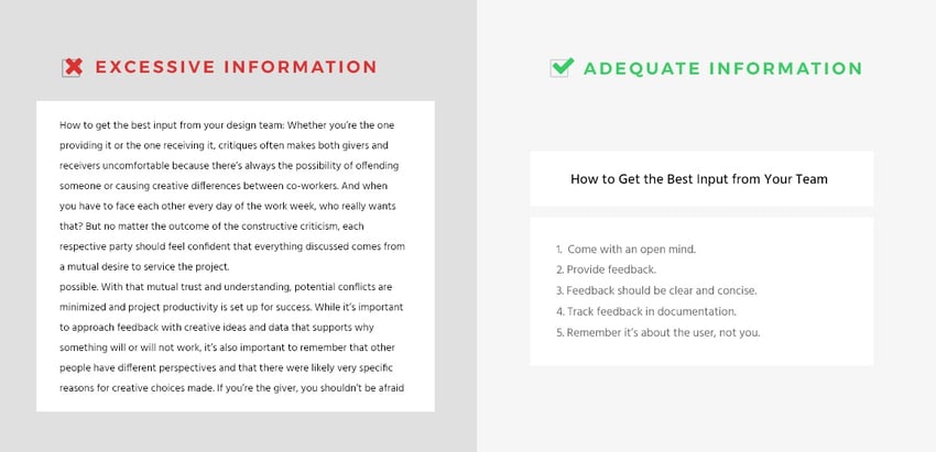
3. EXCESSIVE OR UNORGANIZED INFORMATION
THE SOLUTION: trim the fat.
Yes—over the years, we’ve heard many varying opinions about what the correct word count should be for blog or website content to rank well in search engines.
And while I 110% agree with Rand Fishkin in his recent Whiteboard Friday video—“The Perfect Blog Post Length and Publishing Frequency is B?!!$#÷x”—I also think that there is such thing as too much content, and if someone tells us that the perfect word count is dependent on the industry or the information at hand, it’s easy for us to think “Well my content is very valuable and needs to be explained in detail, so that means it’s OK to put a lot of text/imagery on my site and blog.” It’s easy for us to think we’re the exception to the rule. But the reality is: it’s about users, not egos.
Whether your content is 500 words long or 500 million words long, we have to be thinking about the user and the value our content provides them. This is especially true for mobile, where there’s even less real estate to work with. So, yes—don’t try to fit or fill your content to a cookie-cutter word count, but also know that readers (you and me included) still have a limited attention span and need skimmable content… Squirrel!
Fellow GDD blogger, Emily Malone, shares the same tip to remove the clutter in her recent blog: 10 Conversion Rate Optimization Best Practices for Beginners (check it out—it’s a good read!).
4. BAD TYPOGRAPHY
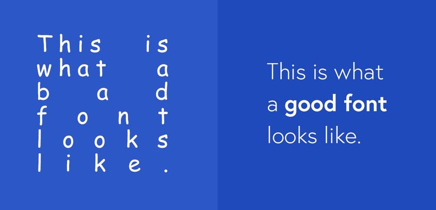
THE SOLUTION: pick a font that's easily skimmable.
To piggyback off the last point, your content has to be easily consumable in order to capture readers’ attention. It has to be well-organized and easy to skim through.
What makes content non-scannable? Well, for one, poor typography. Nothing turns visitors away faster than having to strain their eyes or zoom in to consume your content due to a bad font. If your typography is too distracting or doesn’t match the website’s design, chances are you’ll start seeing higher bounce rates.
Additionally, if your text doesn’t have clearly distinguishable sizes between sections (i.e. a main header vs. a sub-header vs. body copy, etc.), you’re sure to lose visitors just as quickly as you gained them—even if you did choose an awesome font that works for your brand.
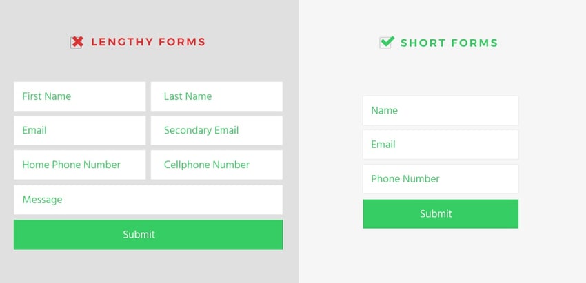
5. LENGTHY FORMS
THE SOLUTION: ask only what's required from your prospects.
No one likes filling out forms, especially if they ask too much of you. And if you don’t format them correctly, it can be the deciding factor between achieving or falling short of your conversion goals.
If you have content that you want to be gated on a landing page, make sure to only ask what you need in order to keep prospects from disengaging. As Pamela Vaughan explains in her HubSpot Marketing article, you need to find your “form field sweet spot”—which is the balance between how much information is absolutely needed and how much information those prospects are actually willing to provide on an initial form.
*PRO-TIP: Consider two main questions when creating your forms: 1) how valuable is the content you’re offering, and 2) what information is needed to capture a qualified lead? If the offer is something they can easily find elsewhere, they likely won’t be willing to hand over a bunch of personal information, if any at all. Moreover, you need to make sure you can actually use the data you’re collecting. More often than not, having form fields for a name and an email (and depending on the form, a message box as well) are more than enough to start collecting valuable information about your prospects.
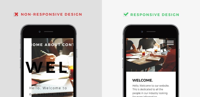
6. NON-RESPONSIVE DESIGN
THE SOLUTION: design for every device.
Though responsive design is becoming more of a standard for website designs today, there are still some that are missing out on the important elements of this type of digital experience.
This means many things. To start, there’s the obvious—the design. But on top of that, you need to consider other elements, such as reducing the main navigation items to just the essentials. It also means ensuring your photos resize correctly, especially on a much smaller screen (which, for phones and tablets, often display vertically rather than horizontally). It even means cutting out non-essential copy to ensure visitors aren’t scrolling through an endless thread of content just to get to the CTA at the bottom.
Learn more about why responsive design is the most important feature to add to your site now.
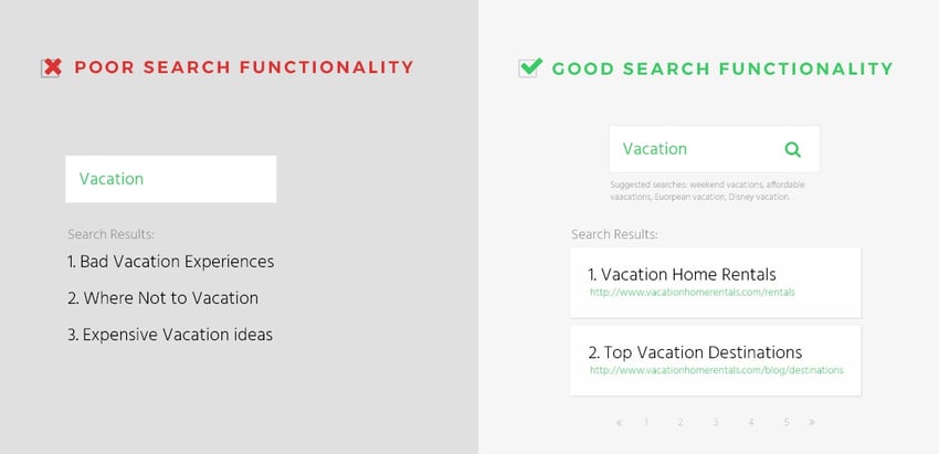
7. POOR (Or NON-EXISTENT) SEARCH FUNCTIONALITY
THE SOLUTION: if you have a lot of content, add a good search feature.
If your website is dense enough with content and you aren’t taking advantage of proper search functionality, then you are missing out (and so are your visitors)!
If you want to make things as simple as possible for visitors to convert (which you do), then you have to empower your visitors by paving a clear path for them to complete the action you want them to take.
Don’t make them sift through page after page to try and find what they’re looking for—just simply give it to them! And the way you can do that with a content-rich site is by adding a search tool to easily find what they’re looking for. Just be sure to tag, categorize and label everything that’s searchable to provide the best user experience possible.
Want to learn more about how to plan your next website redesign?
See how the Designzillas approach has made an impact online by viewing our case studies below.
Topics

Danielle Irigoyen is the Marketing Lead at Designzillas—an Orlando-based digital creative agency and HubSpot Partner Agency. With a chai tea latte and her trusty AP Stylebook always at arm's length, Danielle is passionate about creating well-crafted content and other thoughtful marketing strategies for client-partners that help inspire users to become lifelong customers.


