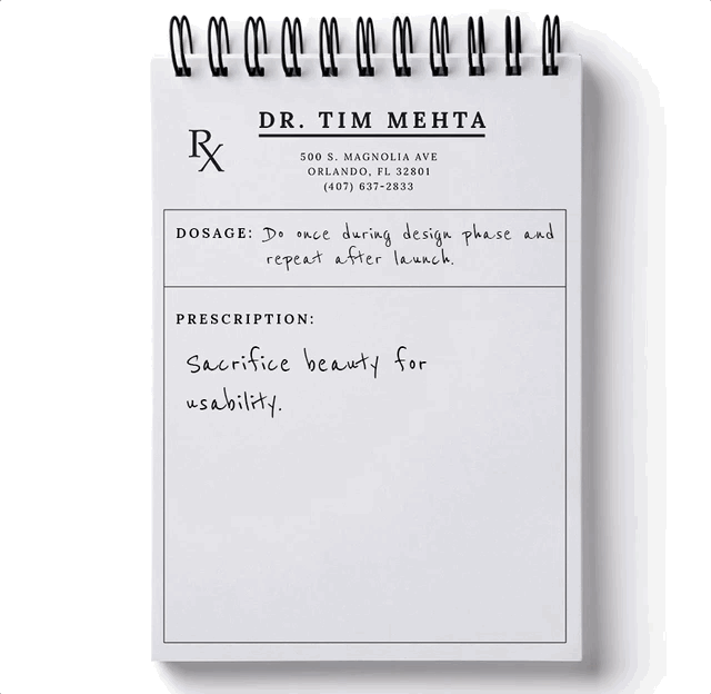
It’s not every day that you get to experience the excitement of redesigning your website. So when you do, it’s absolutely vital that you make it a goal to improve the User Experience (UX). Here, we prescribe you 9 ways you can do that in your next website design.
Full disclaimer: I’m not actually a Medical Doctor.
Fuller disclaimer: It’ll be more fun if you pretend that I am.
1. Keep it recognizable
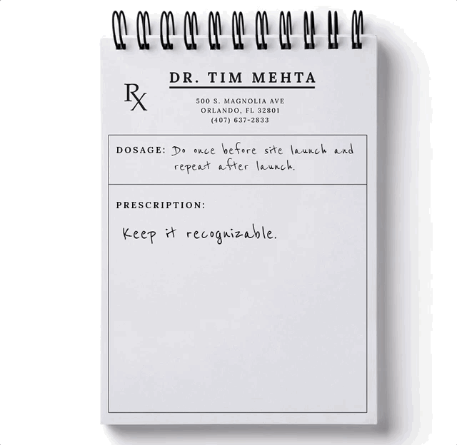
It’s easy to want to revamp EVERYTHING. But don’t try to reinvent the way people use websites. Ease into it with subtle differences that are attached to something familiar.
BRAND RECOGNITION
If you’re rebranding with the new site, make sure that you have consistent and comprehensive branding across your site and your marketing material.
Make your updates simple enough to remember (logo, brand name, design) and don't deviate too far from your previous branding.
Industry/Offering category
If you’re a doctor's office, your site needs to have the basic elements of a common medical professional website.
Forms and other high-impact elements that visitors are used to seeing should be in the same general areas.
They have to see something they are subconsciously expecting.
Google performed a study to see how quickly people decided to stay or leave a website after landing on it.
In 17 to 50 milliseconds, users had formed their opinion or initial “gut feeling” to decide whether to stay or leave the site.
Example of about 50 milliseconds...
What is your brain seeing and deciding in that short of time? The researchers dug deeper to understand what factors influenced the user’s gut feeling.
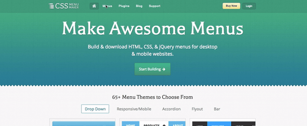
The ones that succeeded in grabbing a user’s attention were ones with low complexity and high relevancy (how the design usually looks for that industry of websites).
Imagine going to your doctor’s office. Now imagine going to the same office a second time, and you don’t recognize your doctor or any of the employees. And the whole place is now structured like an ice-cream shop, not a traditional doctor’s office. That might throw you off a little bit, right?
2. Use subtle animations
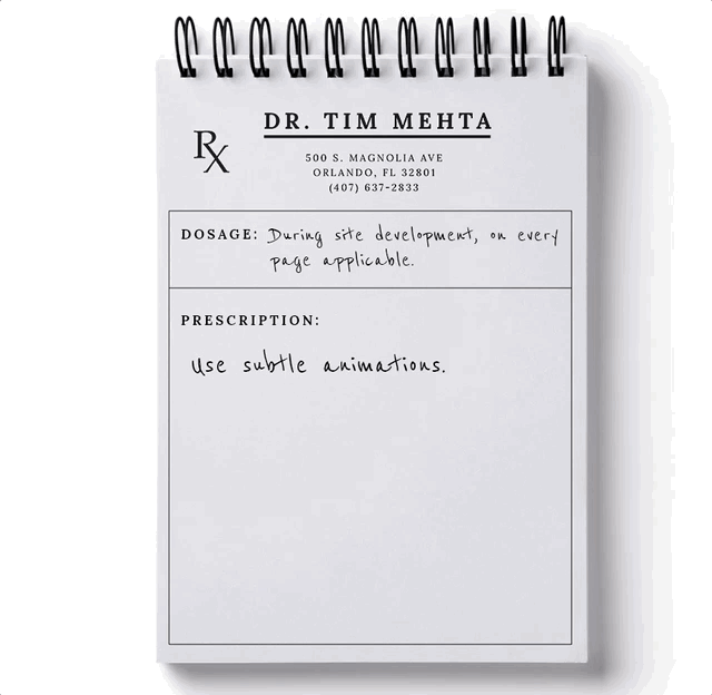
Have you ever been on a site that had rigid, quick animations or dropdowns that made it feel choppy or abrupt?
VS.
Even subtle differences like this navigation fade will have an effect on the subconscious of your website visitors.
Pay close attention to transitions throughout your website and the way different elements are presented and ask yourself "does that look cheap/outdated?"
In other words, would you rather take a jagged pill or a smooth, round pill?
3. Give them some interaction
Let the user become part of the environment. People remember things they participate in more than things they observe.
Some impressive examples:

Remember in class, how much easier it was for you to learn something by participating in it instead of just reading a chapter on it?
Apply that same logic to your website - let the user contribute to their own experience, specifically within the design. If they are merely observing, they won’t remember their visit nearly as much.
Think about it - if a doctor gives you routines/exercises to do at home and you do them on your own, you’re more likely to remember them and feel more fulfilled than if you let the doctor do it for you every time. 
4. Organize and segment your content based on your users
According to an article Shanelle Mullin wrote for Conversionxl, web personalization is...
“Essentially, it’s the real-time individualization of a site to suit each visitor’s unique needs and guide them through a custom conversion funnel.”
Even if your website serves one product to one type of person, you need to remember that no two people are the same.
Pedro vs. Wilma Example: Pedro might prefer to read long-form content, while Wilma might prefer to watch an explainer video.
Giovanni vs Hannah Example: Giovanni might be more persuaded by your features, but Hannah might be more persuaded by user reviews.
You need to make sure your site caters to all of these users. This does NOT mean to stuff everything that you can on your website - it means to ensure that your website is designed to personalize the experience for your visitors.
Pedro vs. Wilma Solution: Having a page that hosts a video on top and long-form explanation in text in the region below it.
Giovanni vs Hannah Solution: Showcase a sample of user reviews on your homepage (possibly with a link to more) and include a region with a “Product Features” CTA to another page that covers the features of your product/service.
But if your site serves people who are looking to accomplish different actions, then it’s imperative that you create a seamless user path for each of those individuals.
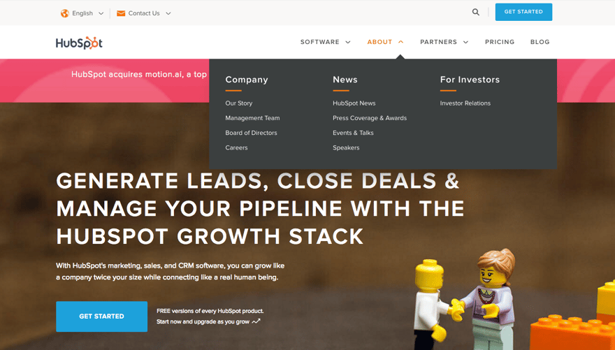
HubSpot does a great job of this. Just in the navigation alone, they are calling out to each type of persona that would use their website without over-crowding their site and also without causing any confusion as to where to go.
A Doctor is going to prescribe different treatment for an elderly person who has already had 3 back surgeries than an athletic 20-something who has never hurt themselves before. Both are patients coming to the same doctor, but their journeys are catered differently based off of their needs.
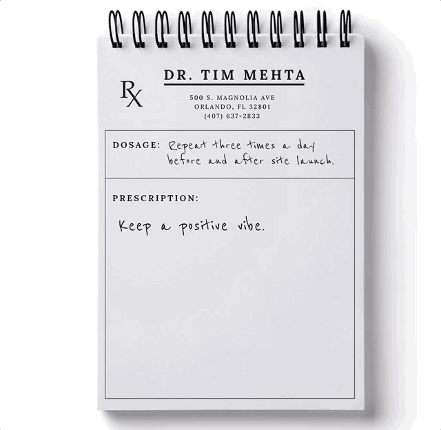
5. Keep a positive vibe
One thing you need to know is that our brains make associations with the world without us being conscious to it.
For example, the words we hear.
If we see the word “shitty,” our brain is going to automatically shift to the feeling that word creates in us. Regardless of context.
Content expert Danielle Irigoyen writes in her recent article on website copywriting...
“...you want to be remembered for the positive, solution-oriented tone you set in your copy—not the negative stuff...”
Which is why saying “Use a revolutionary product” will always work better than “Don’t use a shitty product”
Why? Because people’s “lizard brain” remembers the word “shitty product” being on your website, and that’s never a good thing.
Imagine going to the doctor’s and they’re like “we’re going to make sure your disease doesn’t get worse” instead of “we’re going to get you all better again”. Totally different feeling in each of those statements.
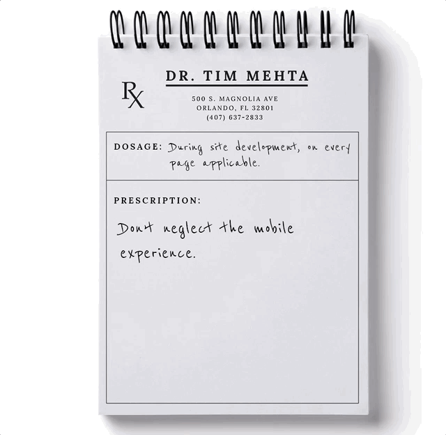
6. Don’t neglect the mobile experience
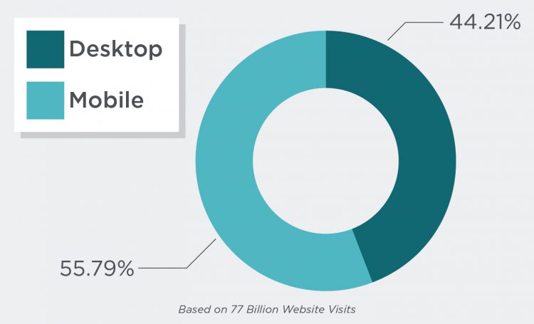
It’s so easy to solely focus on the desktop design of your site. And depending on what you can see in Google Analytics as far as your mobile vs desktop visitors, you might be validated in focusing on desktop more.
But the general trend is going in the opposite direction. Even at home. If you’re sitting on the couch, what is easier to browse the web - continuing to sit on the couch, or getting up to turn on your computer? Smart UX will tell you that sitting on the couch will win out 9/10 times.
Your user’s mindset on mobile is also different than on the desktop. You have more distractions with all the other apps on the phone, on top of actual phone calls that might interrupt the experience.
Some examples (and free tips) are:
- If your website had certain areas where it’s easier to use on desktop or mobile, provide a link “send this to my mobile device” or “send this to my desktop” via email, evernote, text message, etc..
- Make the font larger for your mobile site.
- Do an audit of your designs from your actual phone and identify any areas that might be difficult (Ex: small buttons, small text, imagery that doesn’t fit, etc.).
Imagine trying to get a medical consultation while on the go versus being in the office. They are two completely different experiences. The way the doctor gives you the information as well as what information they give are adjusted depending on the patient’s current environment.
7. It’s okay to sacrifice beauty for usability
Is it better to look like a million dollars, or actually have million-dollar revenue?
A beautiful, attractive design is a huge factor on whether users stay or leave your site. But just like everything in life, beauty must come in moderation.
Aesthetics are not the only reason whether people “convert” or not.
An efficient website should be like the structure of a car.
The first impression (hero image, homepage, marketing material) is something beautiful that draws a person in, like the car’s model and color.
Once you get in the driver’s seat though, not everything is designed for attractiveness. But it works, because the user knows how to drive it immediately.
Anything that requires a user’s attention (or action) should be very clear, simple, and follow the heuristics that they are expecting.
Marketing guru Neil Patel discusses this in his article about ugly web design…
“Too much innovation can alienate. If a user prefers the old-school aesthetic of your outdated design, then so be it. Your business can continue to thrive.”
You’d rather have a bulky cast that works rather than a sleek, beautiful one that leaves you vulnerable to re-injury. 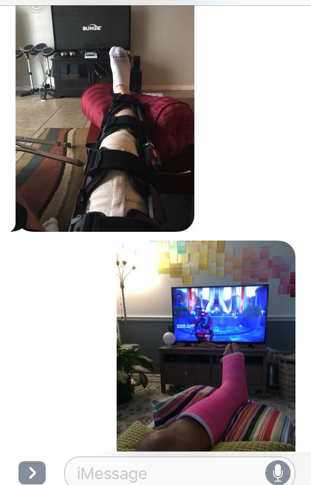
Some casts are more attractive, but some work better. All are good for playing Destiny.
8. Leave your ego at the door
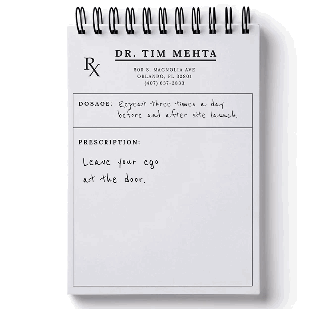
When redesigning a site, it’s easy to just go with the designs or wireframes that you find attractive.
But that’s like ignoring your doctor and just doing what you think is best.
In this case, your design research team and your users are the most valuable source of information on what approaches to take with your design.
For example: You might reealllyyy like bananas.
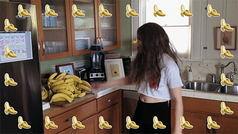
But every time you eat them, you get a crazy stomach ache. So you go to the doctor, and the doctor prescribes that you stop eating those bananas, no matter how much you love them.
So in this case, your body is the website. Bananas are a part of the design that you love (aesthetically). The stomach ache is bad UX. The doctor is your design research team.
Even though sometimes, you don’t even need a doctor! If you can accept the fact that bananas cause friction in your ability to enjoy your life, then you can make the independent choice to stop eating them.
Same thing goes for design - if there’s an element that you are particularly attached to but it’s causing a poor experience for your users, you can swallow your pride and decide to remove/replace that element all on your own.
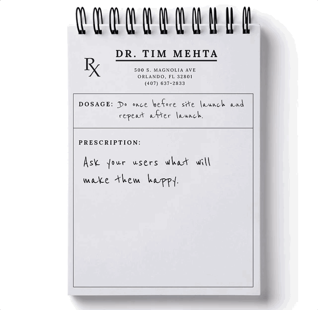
9. And most importantly...
You’re redesigning your site, right? So that means, you probably have a current site.
Do you want to figure out what you can do with your new site that will make your customers happy?
Well it’s a very convoluted process. Super complicated and ridiculously inconvenient. They say that those who embark on this journey never return.
Actually, no.
In reality, it’s very simple and the most valuable information you can get the least amount of effort possible.
Just effin’ ASK them.
There are so many amazing survey tools out there, so just Google “website survey tools” and choose your favorite.
We prefer HotJar. It’s free and even gives you some great example questions to help you get started.
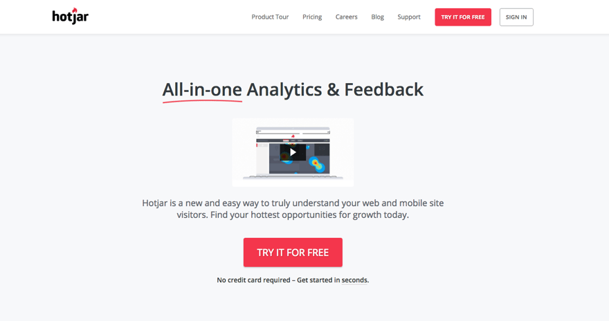
On your high impact pages, throw up a survey and ask how you can make their experience better, or what’s missing from the page that would help.
Even if you only get a handful of responses, it’s the most valuable qualitative data you can come across.
How do you think doctor’s understand how to fix you? They ask you for your symptoms. You are treated based off of what you claim to be experiencing. Do the same thing for your web visitors!
10. One more, under-the-counter tip…
Don’t settle.
You’ve done an awesome job redesigning your new site, and now it’s live and booming. But good health takes constant exercise and maintenance!

Make sure you have the right tools installed and the right team in place to continuously measure your website’s performance.
Ideally, you’ll want a healthy dose of testing and experimenting to see how you can improve your user’s experience.
Comb through all the data and identify where your website’s pain points are. Then, come up with creative solutions on how you can solve that pain point.
As you grow, you adjust your lifestyle and diet based on the environment around you and the things you learn from the people you interact with.
Do the same thing for your next website redesign, and please don’t ignore your doctor’s orders.
Or should I say, listen to your doctor’s orders ;)

Topics