“Go east for five miles and take the north exit for 35.” This kind of directions may as well be a different language to me. Yes, I’m one of those people that need directions spelled out in terms of street names and landmarks because I have absolutely no sense of direction.
If you’re like me, you’ll easily sympathize with website visitors who arrive on a site looking for a specific product or piece of information and fruitlessly click around for a couple of minutes unable to find that one thing, and bounce away back to Google to find an easier site to navigate. OUCH.
For those of you who aren’t like me and you can find your way almost anywhere–have you ever plugged an address into your GPS and after following it for some time end up in an empty field instead of your friend’s mom’s uncle's house?

Both ineffective directions and the wrong directions can be extremely frustrating experiences that will adversely affect your website. High bounce rate, low session time, and low click rates are all symptoms of poor navigation.
Even though website navigation is sometimes viewed as an afterthought, I argue that it is the skeleton that holds all of the pieces of your website together. It is the structure and organization of all of your brilliant products, services, and content.
If you underestimate the importance of navigation and throw together your website’s navigation based on assumptions and hunches, you will likely see the effects in your results and your SEO. I love what Rebecca Churt says in her blog, that SEO can now be thought of as “search experience optimization.”
With this in mind here are the 7 steps you can follow to get to your destination–a website that is so well organized that users will be throwing their money at you.*
*Results not typical
Feel free to jump to a step you'd like to learn more about:
Step 1: Determine the Destination: Where Are Your Users Trying to Go?
Step 2: Give Them Guidance: Where Do You Want Users to Go? What Do You Want Them to Do?
Step 3: Speak Their Language: Use Familiar Labels
Step 4: No Distracted Driving: Eliminate the Unnecessary
Step 5: Get Organized: Information Architecture
Step 7: Observe, Measure, and Iterate
Step 1: Determine the Destination: Where Are Your Users Trying to Go?
One of the challenges as a UX designer is keeping all assumptions quiet until you have the data and research to back them up. Especially when it comes to navigation and information architecture, the wrong assumptions could send your users into a lake and away from your website forever. Duct tape them if you need to, but keep them quiet!
Your first step should be to determine through analyzing user patterns and behavior what problem your users are trying to solve.
Sure, you know where you want your users to go (hopefully), but what are they actually doing? Does their behavior indicate that they are having to hunt for answers? To answer these questions, I view it as a puzzle you’re trying to put together but you’re not sure what the final image looks like. You’ll gather all the pieces of the puzzle through various research and testing methods, and then take a step back and determine collectively what the picture tells you about the users.

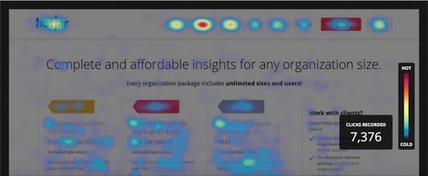
Heatmaps
One of the first things I like to look at are heatmaps. There are different heatmap tools out there, but each tool after installed on your site will show you the specific elements that visitors are clicking on, how far down the page they are scrolling, and mouse movement patterns. For navigation planning this can be a helpful to see which navigation links are being used:
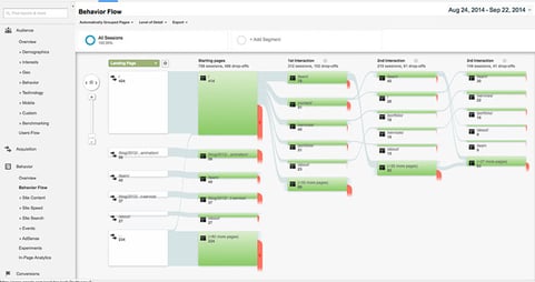
Google Analytics
I also look at Google Analytics, which can be a swirling path into oblivion if you’re not careful so make sure you have a few key metrics in mind before you go hunting through all of the data. I look at bounce rate, pages with the most visits, and behavior flow. These three measurements should give you a pretty good picture of user behavior.
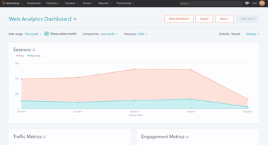
Hubspot Web Analytics Dashboard
If you’re a Hubspot customer, you can also go into your portal and reference those numbers. The Hubspot Web Analytics dashboard makes gathering this information effortless by organizing metrics by traffic and engagement.
Here you can see average session length, pages per session, percentage of returning visitors and more. These metrics can add another piece to the puzzle to finding out if users are finding what they’re looking for based on their engagement with your site.
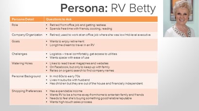
Personas
Creating fictional representations of your ideal customer, referred to as personas, helps us as web designers not only get into the mindset of the users we’re targeting, but also perceive them as actual human beings with feelings whom we need to empathize with in order to create a good user experience for them.
Consider User Flow Based on Buyer’s Journey
Mapping out the paths your personas would take to get to your site as well as the pages they would be expected to touch given a specific goal should also guide you in designing your navigation.
Consider their path given where they are at in the buyer’s journey and what that means for the type of content they will be seeking out on your site. A user who is at the decision stage of the buyer’s journey will be looking to complete an action such as contacting someone, signing up for a service, downloading a demo, or other bottom of the funnel offer.
This means that their path will be different from even the same persona who is at the consideration stage, and is still researching and comparing solutions. Their user flow will likely be less direct, and will touch pages with product or process content.
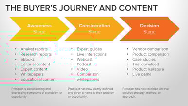
If you run retargeting campaigns or social media ads where a user has the potential to enter your site from a landing page where it’s likely that’s the first time they’ve heard of you, you’ll also want to consider different points of entry to your site.
It’s imperative to provide these users with clear directions to the information they are looking for or they will promptly bounce, without any intention of returning.
Step 2: Give them Guidance: Where Do You Want Users To Go? What Do You Want Them To Do?
There will always be business goals associated with your website project. Once you have the pieces of the user behavior puzzle put together, it’s time to define what it is exactly that you want users to do.
Most often this will be a matter of interviewing stakeholders (the client or internal decision makers), assessing your marketing funnel offers, and evaluating your persona goals. This doesn’t have to be laid out in an official format, but the act of defining these key goals will assist in your navigation decisions.
The important thing to remember is that to have a successful navigation for your website, the business goals and user goals need to align. If you create a navigation structure that sends users to places they aren’t trying to get to or conversely, you send users down the path they are looking for but their destination isn’t tied to a business goal, then results will suffer.
Key Takeaway: Business Goals & User Goals need to Align
“Allow your users to be successful. Successful users accomplish their goals; and supporting user goals is the most important part of accomplishing business goals.” - THERESE FESSENDEN
Step 3: Speak Their Language: Use Familiar Labels
One of my favorite things about UX is trying to get inside and understand the minds of users. For this crucial step, think about your personas and what kind of language they would use. If you feel you’re too far removed from your personas to relate, seek out people you know that would fit into your personas and ask them how they would refer to certain terms you’re considering putting in your navigation.
For example, would a consumer say “renovation” or “remodeling”? The key thing to remember at this point is to try and eliminate all possible confusion for your most uneducated, non-tech savvy user. On a scale of 1 - 10, if your knowledge of the industry is a 10, then you should use the terms someone at a knowledge level of 2 would use.

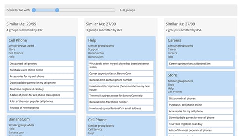
One tool you can use to validate your navigation labels is a method of user research called open card sorting. Closed card sorting is an activity where users are asked to sort topics into provided categories. This is useful if you’ve already determined what your top level navigation items should be.
If not, you can conduct an open card sorting test where users are given topics (based on your website content) and asked to categorize them as well as name those categories they create. This can be an incredibly insightful exercise into your persona’s minds and language patterns.
You don’t necessarily have to use all of the information you gather from your users, but it will help you know if you’re on the right path with your information architecture, labels, as well as uncover some blind spots you may have had.
Step 4: No Distracted Driving: Eliminate the Unnecessary
Think back to the last time you went to Target. How many things did you end up buying that you had no intention of buying when you walked in?

Stores like Target purposely lay out their stores to distract and entice you to buy more than what you came for. Your website should be designed with the opposite intention. After step 2, you should have your top 2-3 goals you want your users to accomplish. I know it’s tempting to put all the things on your site.
The problem with this approach is that if you put a bunch of links in your navigation that aren’t going to help users get to their destination, they will get confused on which path they should take. They will get distracted like a millennial in Target and either dart off in different directions ultimately getting frustrated, leaving without converting and likely to never return.
Our mission as UX designers is to gently guide users to what they are looking for, which should align with what we want them to do. In order to do this, we’ve got to define the paths and then design them in the navigation structure with as little distraction as possible.
Of course this is easier said than done sometimes. You may have a client that insists they need ten pages within their About Us section, and you will need to structure your navigation to be as effective as it can be in spite of these inevitable requirements we’re given by clients and stakeholders.
Step 5: Get Organized: Information Architecture
Take Inventory
If you have a large website, now is a good time to create a full inventory of all pages on the site. If you have a CMS you can export a list right into Excel. With your proposed categories (top level navigation items) start placing each page of your site into a category that follows what you’ve discovered about your users, your persona information, and business goals.
The most common methods of organizing content is either based on your product or process. If you haven’t done the card sorting exercise yet, this would be a good time to do a closed card sort to see how your users organize your site content given specific categories. If you’re on the fence about going with a process or product structure, your users may be able to settle the debate.
Consider Current Site Organization Design
At this point in the process your navigation plan should be taking pretty good shape. Before you finalize your site map though, you’ll want to consider how the current navigation is organized.
Will a significant change in the navigation cause your content pages to have a mismatched look and feel if a user takes a new path? If you’ve employed design patterns such as using certain colors to differentiate between groups of content, then you’ll want to make sure you have a plan for updating those pages so your users don’t feel confused.
Step 6: Design & Test the Proposed Navigation
Design
One design consideration to keep in mind is that users spend an overwhelming majority of their time looking at the left side of the screen, so you’ll want to make sure your most important top navigation links are on the left.
Also, is the look and feel of your navigation out of date? Are there visual and interactive improvements that could be made to give the user the impression that your company is on the cutting edge? It may seem minor, but subtle changes to the navigation can affect the user’s first impression of your site.
Remember, you’ve only got 8 seconds to capture a user’s attention, and many users view a site’s menu to determine if your company can provide the information, service and products they are looking for.
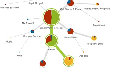
Tree Testing
Once you’ve completed your site map, it’s time to test it before launch to see how close you came to hitting the mark. One way you can do this is with tree testing. OptimalSort has a great tool for this called TreeJack that’s easy to use and provides valuable insight into your “tree” for validating your information architecture.
Users are given a clickable version of your site map to use in order to complete specific tasks. After the test is run, you can see how many users were able to find the “correct” or intended path, how many failed, and where they took wrong turns. You could also start your navigation project with this method, to identify hang-ups for your users on your current navigation.
Internal & Consumer User Testing
Before going live, it’s also a good idea to conduct some user testing. The platform I prefer for this kind of test is usertesting.com. You can use a link to either a draft page with your working navigation, a link to an InVision prototype, or an XD prototype.
Users will be asked to complete a series of tasks where they will be required to use the navigation menu, and then provide feedback on whether or not items were where they expected them to be, labeled with terms they understand, and if any gaps were present. This kind of testing can be conducted by internal users or a consumer focus group. Internal testing is useful for uncovering industry-specific issues that you might not be aware of, while consumer testing will shed light on potential usability issues.
Step 7: Observe, Measure & Iterate
Once you’ve gathered feedback from user testing and tree testing and made the appropriate revisions, you’re ready to launch your new navigation. At this point it’s critical to observe over the coming weeks and months the effects of the new navigation. What do the new heatmaps show? What does the behavior flow look like? How about the average session time and conversion rates? These metrics at a minimum should all be monitored consistently for any potential red flags that should be addressed quickly so as not to leave a bad taste for new users.
Put All of the Pieces Together
Effective and efficient navigation is crucial to a good user experience and getting results from your website. I’ve covered a lot of ways to gather all of the pieces of the navigation puzzle, but the most important thing to remember is to never make assumptions about what your users are doing or trying to do.
Often you can’t even go buy what the users themselves say they are trying to accomplish on a website. You can only be sure of their true goals by looking at what they actually do according to the data, and observing their actions in user tests. If you don’t see results at first, keep iterating until you get it right. That’s the beauty of growth driven design–continuous improvement is baked into the process!
Want to go deeper? Check out this article or the Growth Driven Design Certification Course.
Topics